Sphere Agency
The Sphere Agency website redesign aims to enhance user engagement, drive higher traffic, and boost lead conversion rates. The project focuses on creating a user-friendly, visually appealing interface that aligns with the brand's identity while optimizing performance for seamless navigation and accessibility.
Role
Visual & UX Designer
Industry
Advertising Agency
Year
2024
Duration
4 months

Challenges
The agency’s website struggles with high bounce rates due to poor content hierarchy, slow access to portfolio work, and lack of engaging visuals. Bangkok-based marketing professionals expect to see content immediately. The challenge is to redesign the site with a clear structure, fast navigation, and a visually compelling showcase of the agency’s expertise.
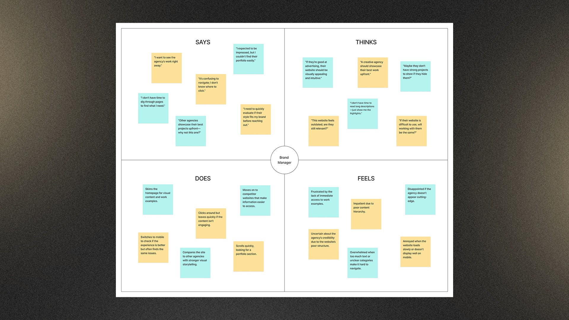
User Reseach
Through a combination of user interviews, usability testing, and performance report analysis, I gained a comprehensive view of how users interact with The Sphere Agency website. This research revealed critical insights into user pain points—particularly around content hierarchy, portfolio accessibility, and visual engagement—which directly informed the redesign strategy. By validating qualitative findings with quantitative data, I ensured that proposed solutions were both user-centered and data-driven.
User Interviews
I interviewed users to explore their expectations, goals, and frustrations when navigating the current website. This helped uncover underlying pain points such as difficulty locating key content and lack of visual engagement.
User Interviews
I interviewed users to explore their expectations, goals, and frustrations when navigating the current website. This helped uncover underlying pain points such as difficulty locating key content and lack of visual engagement.
User Interviews
I interviewed users to explore their expectations, goals, and frustrations when navigating the current website. This helped uncover underlying pain points such as difficulty locating key content and lack of visual engagement.
Performance Report Analysis
I analyzed data from the current website’s performance reports, including metrics such as bounce rates, session durations, and click paths. This helped validate findings from the primary research and offered additional context into user behavior patterns, particularly where users were dropping off or struggling to engage.


Evaluating Current Design
To improve The Sphere Agency website, usability testing was conducted to understand how users navigate content, access the portfolio, and engage with visuals. Participants were asked to complete tasks such as finding key information, exploring the portfolio, and interacting with calls-to-action. The goal was to identify pain points and opportunities to enhance usability, ensuring a more intuitive and engaging experience.
Key Insights
Users struggle to find key information quickly
Poor content hierarchy makes important details hard to locate, leading to confusion and bad navigation.
Lack of visual hierarchy reduces engagement
Users struggle to distinguish key content from secondary elements, making the experience feel less intuitive.
Portfolio access feels slow due to content hierarchy
Users expect quicker access, but the way information is structured makes it harder to reach.
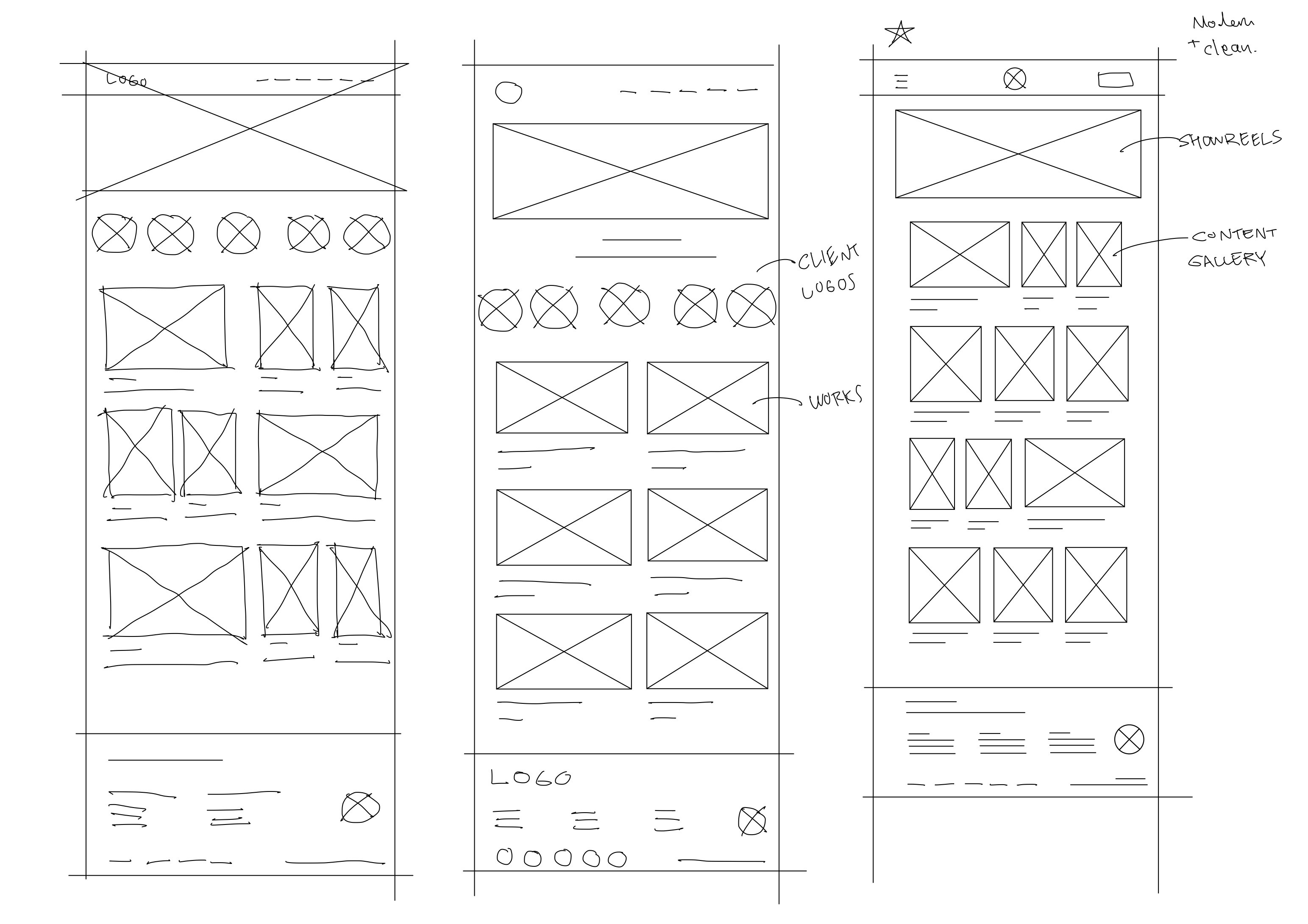
Ideation Process
Through user research, competitive audits, and pain point analysis, we identified key issues in navigation and content hierarchy. We sketched initial concepts, refined them into wireframes, create basic layouts to define the website's structure and content hierarchy. We then developed low-fidelity prototypes, focusing on functionality over visual details, to quickly test and refine our ideas based on user feedback.

Refining with User Insights
After creating the high-fidelity prototype, we conducted usability testing to validate the redesign. By observing users' interactions, we identified key friction points and synthesized the insights into clear design refinements—improving content hierarchy, navigation, and visual clarity for a better user experience.

Final Design
The redesigned Sphere Agency website offers a user-friendly, visually appealing interface that aligns with our brand identity. Key improvements include an intuitive content hierarchy, enhanced portfolio accessibility, and engaging visuals, resulting in increased user engagement and higher lead conversion rates.


Measurable Outcome
The redesigned website successfully improved performance, increasing traffic, generating more leads, and boosting average engagement time per session by 20.6%. With a 15.2% reduction in bounce rate and optimized user flows, the new design enhanced user engagement and drove higher conversions while maintaining a visually cohesive and functional experience.

Key Takeaways
This project helped me uncover key usability issues, unclear content hierarchy, low visual engagement, and poor portfolio visibility that impacted user experience and conversions. Usability testing revealed real user pain points and guided effective improvements. One challenge I faced was balancing brand aesthetics with functional clarity, especially in restructuring content without losing visual appeal.
Next time, I would involve users earlier and iterate more often to align design with user needs. This experience deepened my understanding of user-centered design and the value of continuous learning.


