Sowon Entertainment
The website design for Sowon Entertainment focuses on showcasing their creative works and productions to enhance their visibility. With a visually striking and intuitive design, it ensures a memorable experience that establishes their presence in the entertainment industry.
Role
Visual + UX Designer
Industry
Entertainment
Year
2024
Duration
2 Months

Challenge
The challenge was to design a website that captures Sowon Entertainment’s lively brand aesthetic while delivering clear, intuitive functionality. It needed to visually highlight key entertainment content that draws audience interest—ensuring an engaging experience. At the same time, the site had to present Sowon’s in-house artists and productions in a way that invites brand partnerships and collaboration opportunities.
Discovery & Alignment
I began the project by organizing a discovery session with the internal team and key stakeholders. During this phase, we worked together to define the business goals and establish a clear brand direction. This collaborative alignment helped ensure that everyone was on the same page and that all design and content decisions moving forward were rooted in a shared vision.
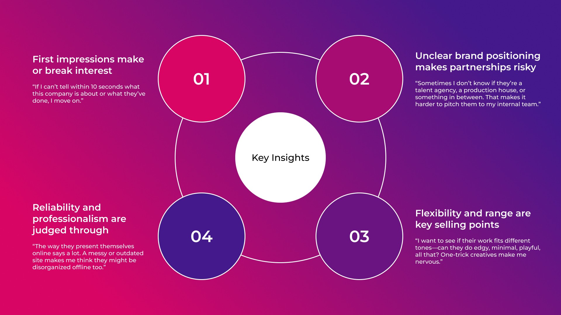
Persona
Developing the persona of May helped focus the design on what truly matters to potential brand collaborators—clarity, credibility, and ease of use. It guided key decisions around layout and content presentation, ensuring the site not only looked visually strong but also supported real business needs like partnership evaluation and trust-building.

May is a brand manager who needs a clear and visually engaging way to evaluate creative partners because browsing unclear or incomplete websites slows down her decision-making and adds risk to potential collaborations.
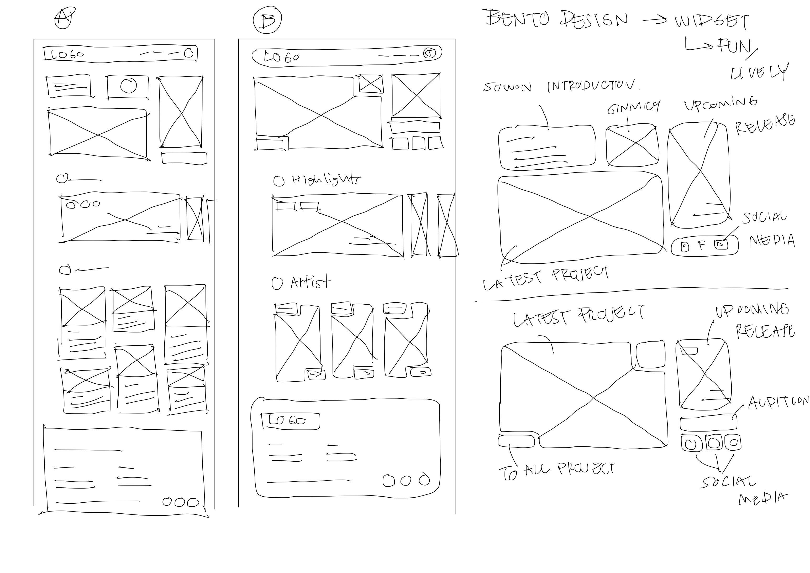
Wireframes
For Sowon’s website, I explored a bento-style UI layout to bring a fun, lively, and entertainment-focused feel to the interface. Early iterations tested different grid compositions and content arrangements to balance playfulness with clarity. Through team feedback and refinement, the layout was shaped to highlight key content while keeping the experience visually dynamic and easy to navigate.
Prototyping and Usability Testing
I created an interactive prototype focusing on key flows like browsing projects and artist profiles. Users and internal stakeholders tested it through task-based scenarios, which revealed issues with content density and navigation clarity. Based on the feedback, I refined layout spacing and simplified labels to improve usability and guide user focus.

Accessibility Consideration
To make the website more inclusive, I designed a dark mode to support users with visual sensitivities, such as those affected by brightness or low color contrast. This improves readability, especially in low-light environments, and ensures a more comfortable and accessible browsing experience.

Engaging and Functional by Design
The final design successfully brings Sowon Entertainment’s identity online through a blend of vibrant visuals and thoughtful usability. Clear navigation, responsive layouts, and accessibility features like dark mode ensure a smooth experience across devices. The site not only captures attention but also supports real-world goals—helping visitors easily explore content and encouraging collaboration with potential brand partners.

Key Takeaways
This project successfully delivered an engaging, user-centered website that reflects Sowon Entertainment’s lively brand identity and meets business goals by showcasing creative work and attracting potential brand collaborators. The site’s structure and design also addressed key user needs around clarity, accessibility, and ease of content evaluation.
One of the main challenges was striking the right balance between playful visuals and functional clarity, especially when exploring bento-style layouts. Iteration and close collaboration with the team helped resolve this, ensuring the final result remained both expressive and easy to use.


